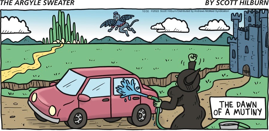
OK, I get that the flying monkey has perhaps pooped on the car, but mutiny? And is this the witch who’s hydrophobic? Can never remember which witch is which.
OK, I get that the flying monkey has perhaps pooped on the car, but mutiny? And is this the witch who’s hydrophobic? Can never remember which witch is which.

I understand in general terms the idea of one or two “throwaway” panels for syndicated Sunday comics. This DSOH seems to have two separate ones. Then goes on to a main comic, which to me looks like two more disconnected jokes — first a typical short-form Horace meta joke (and pretty good!), then finally an extended narrative joke (complete CIDU!). So … what’s up with these?
Just to be clear:
A word play OY:

A one-step pun:
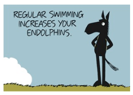
A typical-for-Horace signifier/reality meta joke:

And a “Huh? Wha?” narrative:


Would you cut it up differently? Or see it as more unified? Or have better explanations?
Cartoons in The New Yorker are famously obscure. Time passing may further obscure them, but also provide a patina of remembrance. With this in mind, I present a selection from October, 1972.
How is this different from what I did for decades — stand on a train platform, waiting for the morning train to the city?

Now that we can use Google to investigate our symptoms, is this worse?
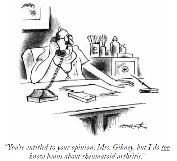
No clue.

Two challenging comics from “Cat and Girl”.

Is this too directly just a political-economy message? If so, it’s a little hard to work out clearly what it’s saying.

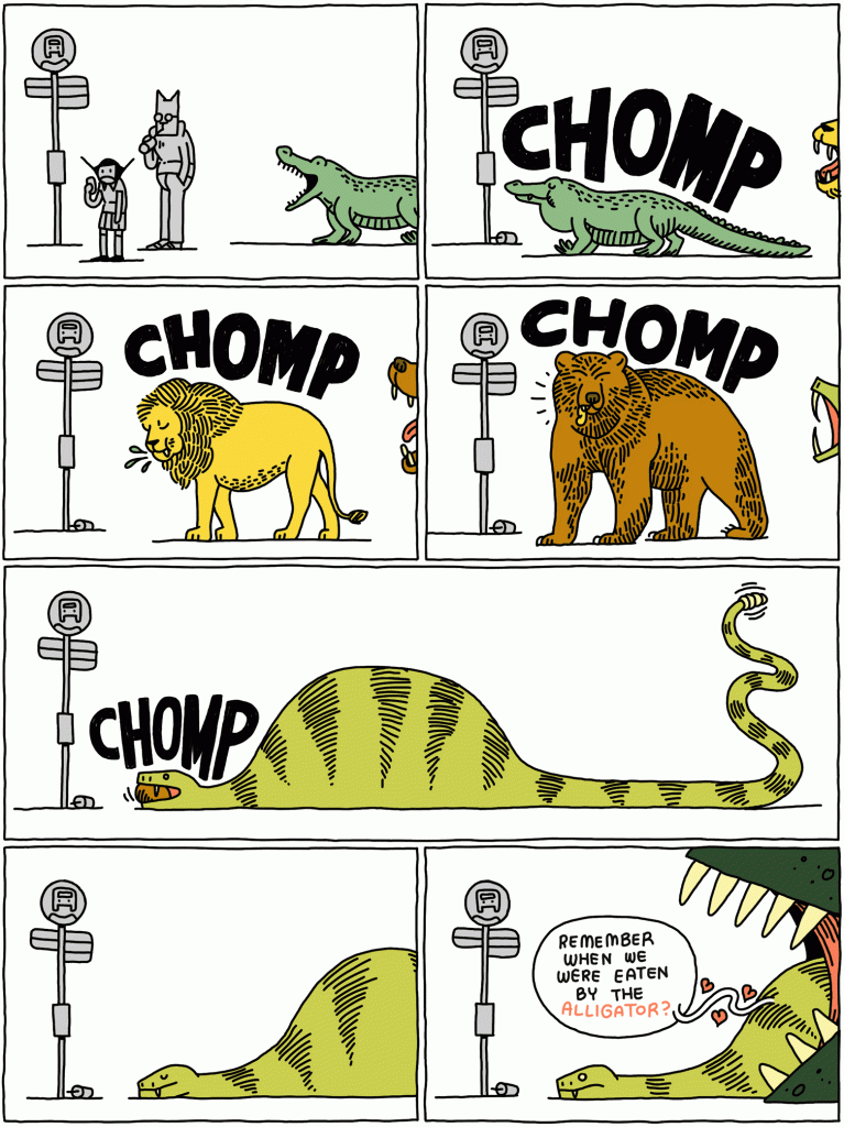
Glad to see the little hearts streaming up in the last panel.
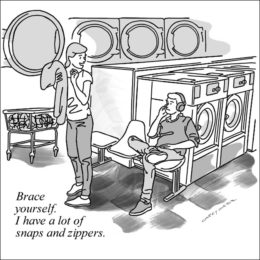
Are they together? Or she is warning this stranger — because generated static will disturb his listening? Or unlikely but disturbing, is she flirting by talking about the factors of her clothes going on or off?
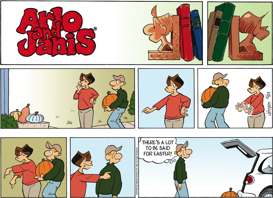
Is it just Arlo wanting to get gripey about the work that goes into Halloween? But how does he come up with Easter for the contrasting example?
Another of the recent Doc Rat suggestions. Jack Applin sent it in and thought “Perhaps this refers to a commercial well-known in Australia?”

As we have asked a few times before, Does this Bliss cartoon work better in b/w or in color?


(As we probably have not asked before, Would this comparison slider presentation work better in this side-by-side format or in a vertical division?)
Our own Zbicyclist mentions the resemblance of the b/w paintings above to some works his family saw on a visit to the Fundació Joan Miró (Museum) in Barcelona, which features work by Miró as well as other 20th and 21st Century artists. This shot from the #FundacióMiró Foundation’s Instagram shows a work which was also shown in Zbicyclist’s family visit photo; the dot in the museum is either black or a very dark blue.
But then, don’t you also think “Such peacefulness”?

Perhaps a bit CIDU-LOL?
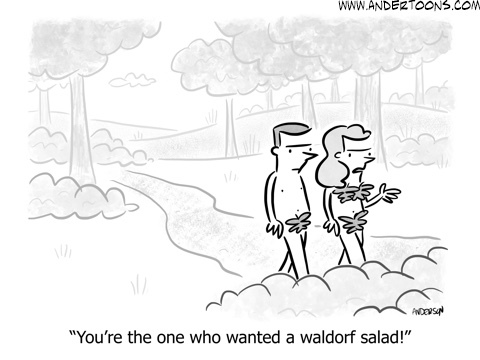
And another food-centered cartoon (older – you may have seen before):
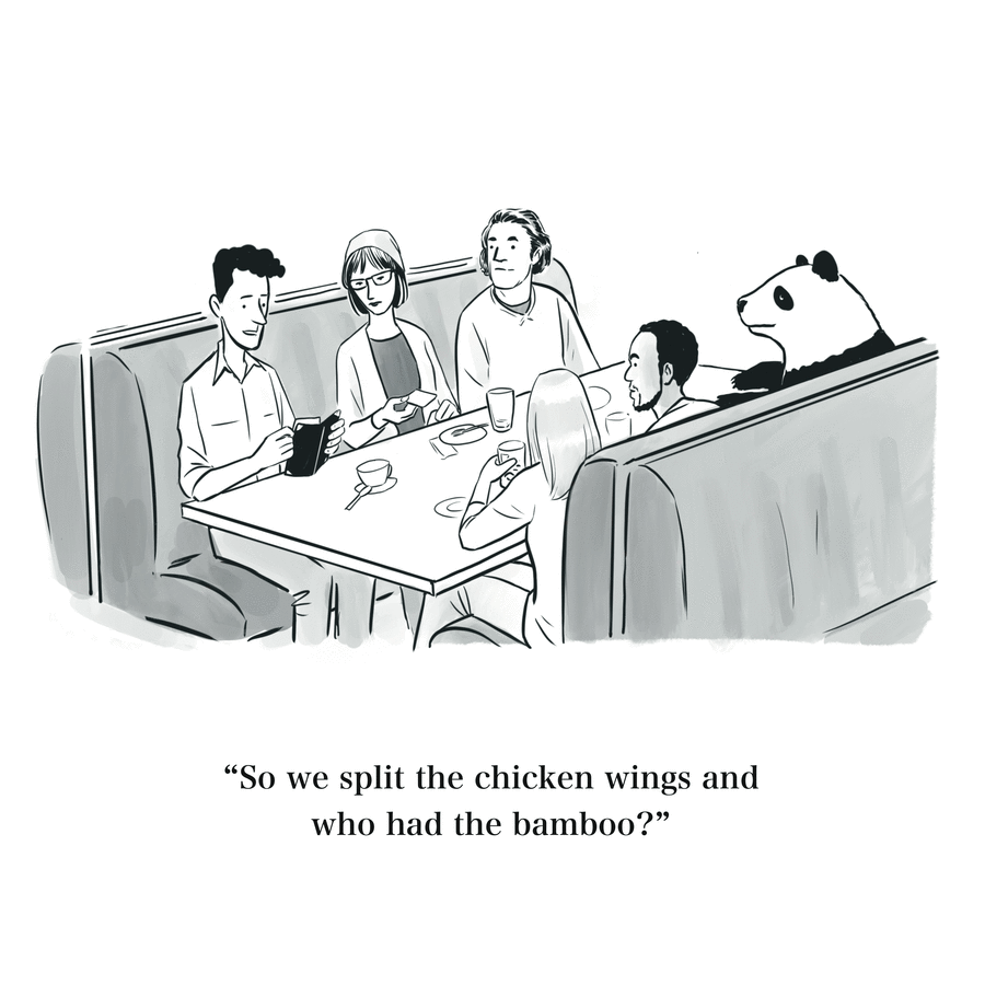
I can forgive mispelins in comic strips, but the sloppy editing in the regular news (and the sloppy headlines) depress me.

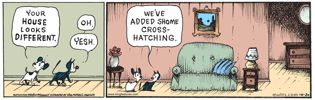
Andréa sends in this update about Mutts:
Patrick McDonnell’s Mutts has a new look: “MUTTS might look a little different to you this week and in the future. If so, it’s because I’ve loosened up my art style, using very little preliminary pencils (in some cases none) and going straight to drawing in ink. It gives the strip more of the power and intimacy of a preliminary sketch, which I love. I’m also freehand lettering the dialogue”
Refusal with very good reason! (Awarded Arlo)
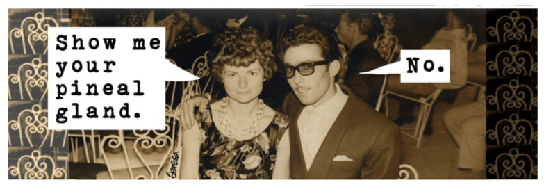
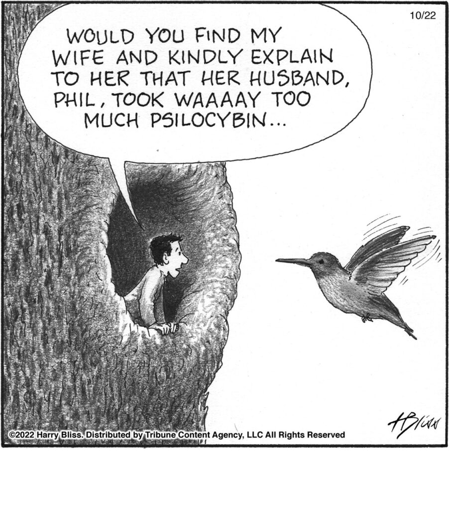
And here is the effect of his overactive pineal:

Back to Bliss!
From Usual John, who says “The second panel translates literally as “he runs me on the bean.” Idiomatically, it means “he annoys me a lot.” But I still do not understand why it is supposed to be funny.”

That’s the artist’s title for this one, as pointed out by Boise Ed, who further points out that we have no idea how that can be an organ-donor card.


