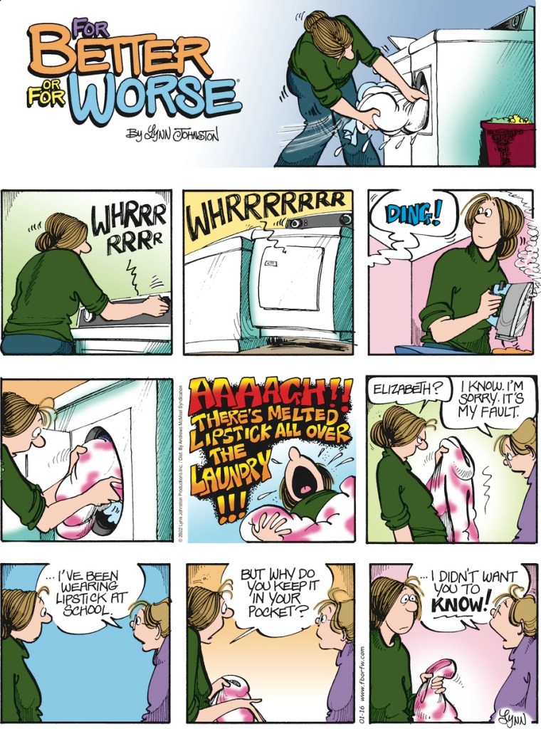
No, not a curse on the cartoon family dog — that would have taken a capital letter. Just an expression of upset over laundry problems.
At any rate, that seems to be the thematic connection for this synchronicity from Todd Tyler.
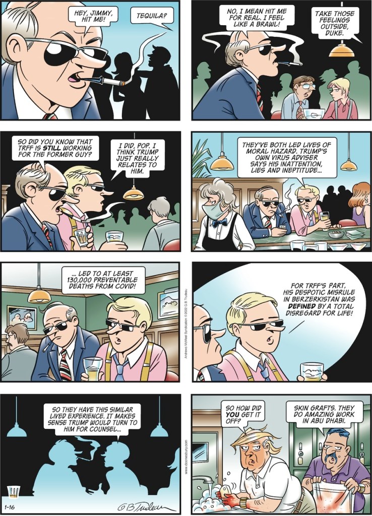
Todd also provides this paper scan and says “This synchronicity is made much worse by the location of Doonesbury and FBOFW as they were printed in the Delaware News Journal today.”

(Notice the layout differs between GoComics as above and this paper edition. Must play havoc for those comics that try to use fourth-wall tricks, like people climbing down from one panel to another!)

I think this post should be tagged “Trojan Horse” and/or “Catch 22“. I cannot see how we can discuss the synchronicity (or lack thereof) just by commenting on “FBOFW”, and any commentary on this “Doonesbury” strip is pre-destined to land in a political sinkhole. Nevertheless, I would like to mention that the characteristics of the respective spots are completely different (fabric vs. hands, and lipstick vs. … [no, that would be crossing the line]). In addition, Elizabeth takes responsibility for her spots, and she even apologizes.
P.S. This postscript containing the word “sucks” is merely to ensure that this comment gets sent to Moderation before it appears. To be honest, I really don’t think anyone else will see this.
LikeLiked by 1 person
Well it was at least tagged “Uh-oh! Smells like partisan politics.”
LikeLiked by 1 person
Sorry to show my shallowness on world affairs, but tho I recognize who they mean by “the former guy”, I can’t quite place the face nor decode the other guy in the final panel, whom they refer to coded as “TRFF”.
LikeLike
Re: the formatting issue. I remember reading years ago a cartoonist who said the formatting for Sunday comics was problematic. A lot of them, Doonesbury being an example, have an extra panel or two that could be placed next to the title panel, or left off altogether by the page layout folks at some newspapers (remember those?) depending on how much space they wanted to allocate for comics. There may even be a name for the extra panels. I forget.
LikeLike
@ deety – That’s not an acronym, “Trff” is his first name, just in standard comic strip “all caps” lettering. If you think that name is bad, his last name is even worse: “Bmzklfrpz”. You can read a pretty good description of the character here.
LikeLike
@ BillR – The title & first “mini joke” panels in the standard syndication layout for Sunday strips are usually called the “throwaway panels”. Most Sunday cartoonists produce them, or at least they have a standard title panel, but newspapers usually skip them to save space. Since that mini joke doesn’t always appear, the Sunday strip cannot depend on any details shown there.
The best explanation I have ever read about the throwaway panels was by Bill Watterson, and included details of the panel divisions and the multiple ways that they can be re-arranged. Watterson was extremely happy to get a format free rectangle for his Sunday strips after his first sabattical, so that he could design the whole space in any way he liked.
LikeLike
Concerning the formatting issue: There are multiple ways to arrange the panels of the “sunday comics” and/or reduced their size. Some arrangements leave the first two “throw away” panels (and the titel panel) out, so those must be optional for the gag / story. It also restricts the panel format very strictly, foiling any shenanigans with extra large panels etc.
You can find a description on Wikipedia:
https://en.wikipedia.org/wiki/Sunday_comics#Sunday_strip_layout
And a good write-up of the inherent problems for the artist on the Calvin and Hobbes site:
https://calvinandhobbes.fandom.com/wiki/Sunday_comics
Bill Watterson fought to have the formatting of Calvin and Hobbes Sunday strips unchanged, precisely so he had more artistic freedom. Basically every other comic strip has to adhere to those rules.
LikeLike
Oops, sorry, didn’t see Kilbys comment about panels, making mine redundant. Should have researched and written faster. Or reloaded before posting …
LikeLike
@ Markus – Your comment was not redundant: you provided two links that I was too lazy to dig out. It’s also worth noting that while the second link gives a lot of information, and use “Calvin & Hobbes” strips for its examples, but it does not plagiarize Watterson’s multipage essay (which I think was published in the “10th Anniversary” book). In addition, they spelled “sabbatical” correctly.
LikeLike
@Kilby – I think you are right about the “10th Anniversary” book, but I can’t find mine (or rather the book I read the essay in), so I give it as a research assignment to whoever wants to trace the original, worth 10 internet points.
LikeLike
The Doonesbury we get in The Guardian (Fridays only) is printed vertically, one panel wide.
LikeLike
The Post-Dispatch usually runs the Sunday Doonsebury vertically, but sometimes there’s a strip doesn’t work that way, like a single large panel taking up two or three panels. They have to switch one of the other strips to the vertical alignment, usually Pickles.
They also run Garfield vertically, but for some odd reason two weeks in a row had Blondie both in that spot and the usual horizontal one. Not sure how that happened, especially twice.
LikeLike
Yeah, not all strips allow a vertical layout. Blondie, Dilbert, and Pickles are among the few that strictly adhere to the nine-panel (6+2 throwaway+title card) Sunday format. Doonesbury usually does, but occasionally goes to a full-frame Watterson-esque display.
My local paper prints Doonesbury, Pickles, and Dilbert vertically but has to switch in another (sometimes Garfield, sometimes Hi and Lois, but never Blondie) if Doonesbury goes full-panel.
LikeLike