… and it had nothing to do with product placement for Amazon. It’s even possible that he might have been able to use Nike’s logo, instead.
…
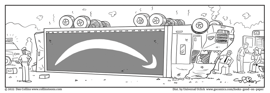
Boise Ed submitted this “Looks Good on Paper” strip as a CIDU, commenting: “How is a truck wreck supposed to be funny? Maybe if it had spilled something funny, but that’s not the case here.“
I agree that it’s not extremely funny, but it’s still worth a small smile. The author was careful to show that nobody was seriously injured (the truck driver can be seen at the right edge of the strip). The gag is based on “anthropomorphic pareidolia“, or in other words, interpreting an expression on a face that isn’t really there. The trucks wheels look a little like eyes, so that the inverted logo looks like a “sad” mouth. Parallels can also be drawn to the inverted Jeep bumper stickers that we discussed back in July.
P.S. If anyone is interested in discovering a whole series of such “facial expression” effects, I recommend watching Pixar’s short film “The Blue Umbrella“.

The Amazon logo is the wrong way round, if you rotate the cartoon by 180°…. normally it would go A->Z on the word Amazon, meaning taking your package from A to Z, but this would go Z->A. Is that deliberate and supposed to mean something? I don’t know.
Once they put the truck back on its wheels, they’ll turn that frown upside down.
If they could draw a Fed Ex truck wreck so that it was somehow poised with its rear up in the air, then the arrow in the logo would be pointing down.
It just doesn’t work for me, I automatically see it as an upside-down truck and flip the whole thing in my head, so I never see a frown. I wonder if the logo being mirror reversed has anything to do with that? Or maybe it’s just that the whole world is suddenly upside-down?
Well since the Amazon logo is a smile, I’m not sure the NIKE logo would mean anything upside down.
The whole point of the comic is that the Amazon logo is known to have been a reference to a smile, so an upside-down truck of theirs is going to have a frown. A very bad day for the truck, its driver and the company.